Two friends, one an architect and the other one several other things, got together to share their passion for
good architecture and design, with a dash of photography and DIY. All this in 3 minutes or less.


Thursday, December 18, 2014

Água de Prata


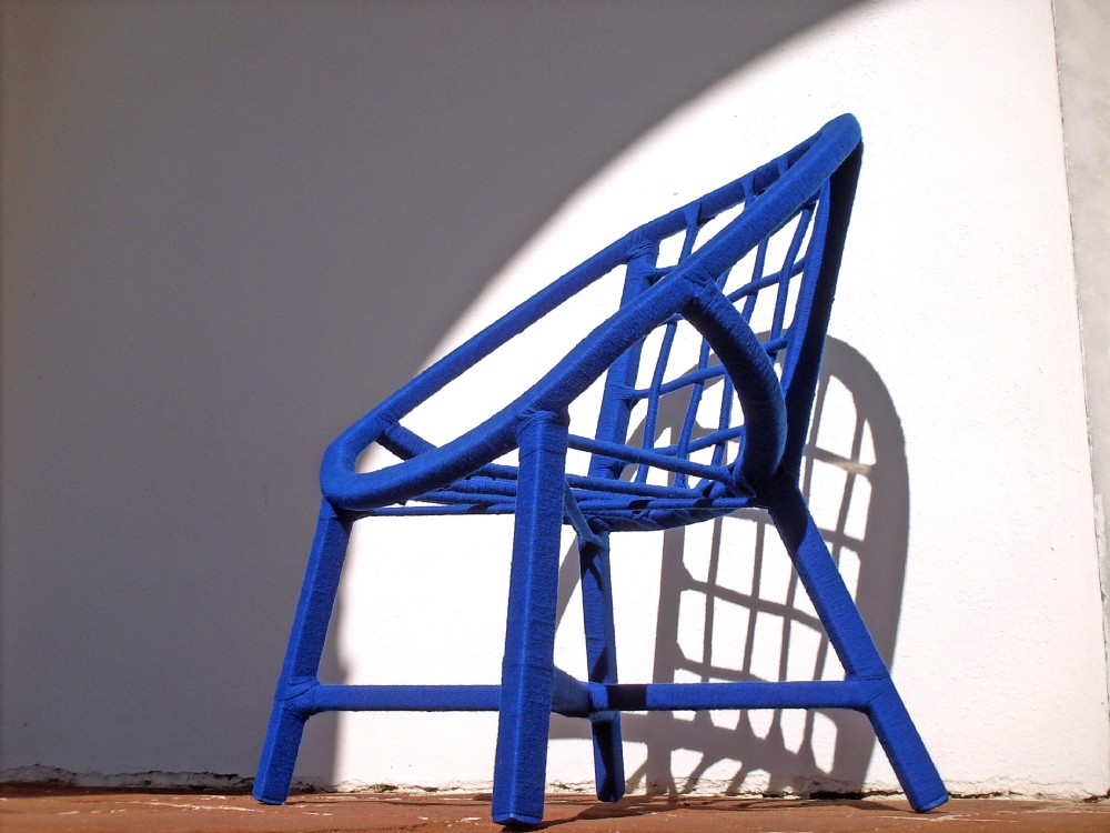
João Bruno Videira, a Science Communication graduate, created Água de Prata in 2006. With a job in the city, João dropped everything to be a self-taught craftsman and designer and moved to Graça do Divor, a small village between Arraiolos and Évora, in Alentejo, Portugal.
Like the TASA project I wrote about here, Água de Prata’s main goal is to combine traditional crafts techniques with contemporary design and needs. Arraiolos wool is the main material and its use is constantly reinvented with each new piece, making it unique and unrepeatable.

Marta.


Wednesday, December 17, 2014

The Versatility of Microcement

I was invited by Nanocrete participate in a Microcrete microcement workshop and, seeing at 351 Design Street we have a particular interest in concrete (Marta wrote a post about this material here) and its multiple uses, I accepted the challenge.
Microcement allows for minimalistic results that are similar to cement and is currently being used extensively due to the contemporary language it conveys to architecture and design. Aesthetics, functionality and the quick application method, make this material a good choice for spaces in need of renovation, especially if the floor or the walls are to be replaced without removing the existing ones.
With a wide color palette, this material is used in interiors and exteriors, and can be applied on the several surfaces, such as wood, MDF boards, tile or even glass. It does not need expansion joints (except when applied on a material that needs these joints), it is water and grease resistant and has low weight.
The versatility of the material allows that extraordinary environments and design pieces be created: the floors and kitchen counters, as in the restaurant Conceito in Estoril (Portugal), or 1300 Taberna at the LXFactory, Lisbon (Portugal); in bathrooms or decoration details, as can be seen in the bas-relief letters in the Hotel Casa do Conto, in Porto (Portugal) designed by the Pedra Líquida architecture collective or in the extraordinary The Initiation project, designed by Wei Yi Design Associates.
Microcrete is a brand among several others in the market, but this one, not only does it give everyone interested the opportunity to participate in a workshop to get to know the product, but it can also state they are 100% Portuguese!

Ana

Hotel Casa do Conto designed by Pedra Líquida architecture collective
Restaurant Conceito
Via https://www.caras.sapo.pt
1300 Taberna
Via mesamarcada.blogs.sapo.pt
Color scheme for microcement
Via http://www.microcementuk.info

Saturday, December 13, 2014

Côa Museum

In Portugal’s northeastern mountains schist rocks that border the banks of the Côa, a tributary of the Douro River, became art panels for our ancestors 25,000 years ago. The last seventeen kilometers of the Côa River, with hundreds of engravings on its margins, became the first Portuguese archaeological park and in 1998 was included in the UNESCO World Heritage List.
This extensive collection of outdoor rock art sets aside the myth that this type of art can only be seen in closed caves and therefore its historical value is priceless.

With the existence of the Côa Valley Archaeological Park there was a need for a museum that would not only welcome some of the panels at risk, but also inform and disseminate the rock art of the Côa Valley to its visitors. Thus, in 2003, during the International Year of Architecture, the Ministry of Culture in partnership with the Association of Portuguese Architects launched a competition for the design of the Museum of Art and Archaeology of the Côa Valley. The first prize was given to the team coordinated by architects Camilo Rebelo and Tiago Pimentel.

Completed in 2009, the monolithic triangular shaped building with four floors (one of them underground), is characterized by the impressive straight and contemporary lines, but nonetheless in perfect harmony with the surrounding landscape.
The concrete structure was designed to look like the local schist through the use of fiberglass molds.
The that ramp crosses the entire permanent exhibition floor connects the spaces and distributes visitors.

The pictures speak for themselves. This museum is worth a visit, not only for the historical and cultural enrichment, but also for the building itself.

Marta.


via Fundação Côa Parque

via Fundação Côa Parque

via Fundação Côa Parque

via arch daily

Tuesday, December 09, 2014

A Padaria Portuguesa


A Padaria Portuguesa (in English "The Portuguese Bakery") is a chain of bakeries that opened their first bakery in 2011. Today there are 25 stores throughout Lisbon.
It all started when cousins Nuno Carvalho and José Diogo Quintela joined forces to create a space that combined good bread with the typical small Portuguese bakery feel.
I will not go into the economic details of it. Suffice to say that they plan to reach 40 stores by 2016 and to create 250 new jobs.
And I won’t argue if the bread is good, the croissant divine and the “pão de deus” amazing.
Here we want talk about design and architecture! So when entering one of Padaria Portuguesa's locations we immediately realize their common denominator: the tones revolve around terracotta and orange, the walls are black, there are funny statements on the wall, and light, lots of it! The flooring is handmade encaustic cement tile by Projecto Mosaico and it is so perfect that it looks like printed, but in fact it is the true handmade encaustic cement tile!

One thing is certain in Padaria Portuguesa: the atmosphere of the bakeries is well thought out to reveal the idea of a traditional and old fashioned place, but being modern, young and fun at the same time!

I only miss the typical cloth bread bags.

Marta.

AUTHOR'S NOTE: after publishing this post Padaria Portuguesa informed that they do have cloth bread bags. And the design... so retro! Check the photo on our Facebook and Pinterest!


dinheiro vivo

listen to my hands

a cidade na ponta dos dedos

Saturday, December 06, 2014

BOP | Bop glass by João Villar


BOP is a beautiful glass, with an intelligent design and it's Portuguese!

2009 saw the beginning of this object, when João Villar was still a Design student. The concept is a glass that doesn’t tip over and the result was a sphere glass with center of gravity in its base allowing it to never tip over. The name actually derived from the English expression Bop Bag.

These blown glass objects are produced individually, in Marinha Grande (Portugal), by craftsmen. Theres are 3 sizes: COPO BOP (approximately 20 cl.), COPO MINI BOP (approximately 8 cl.) or TIGELA BOPPY (approximately 7 cl.), the latter having the same size as the COPO MINI BOP, but slightly wider at the rim.

BOP glasses are currently for sale through the BOPLAND webpage or in the following stores : Hangar Design Store, Original Lisboa, Pátria Interiores, a ELLG Gourmet, Giv Lowe, Rosmaninho, Plátano Decorações, Horto do Campo Grande, a Alma Lusa e a Bairro Arte.

These objects can be used in a vast number of ways, from the more conventional uses, as a glass or a bowl, to a bolder use, such as candleholders, containers for spices or dry flowers; or whatever your imagination will allow.

BOPLAND recently launched cork lid, meaning an even wider use of the BOP glasses.

Here is a good idea for those who haven't decided what to give family or friends for Christmas!

Ana
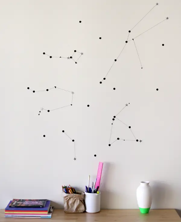
Photo via: https://www.facebook.com/thebopland/photos_stream
Photo via: http://www.bopland.com.pt

Friday, December 05, 2014

DIY Jewelry Holder

The perfect weekend DIY: a hanger, a spray can and some looped screws will make a very different way to store jewelry. And you can even have it on display!

Marta.

i spy diy
morning creativity

Wednesday, December 03, 2014

Accent walls: more than a painted wall

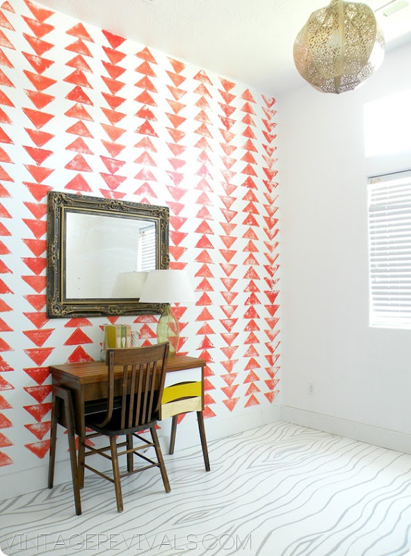
An accent wall can transform a plain room into something different, bright and even sexy. It’s an alternative to wall art and it can be used to personalize a room’s design and claim it as yours.
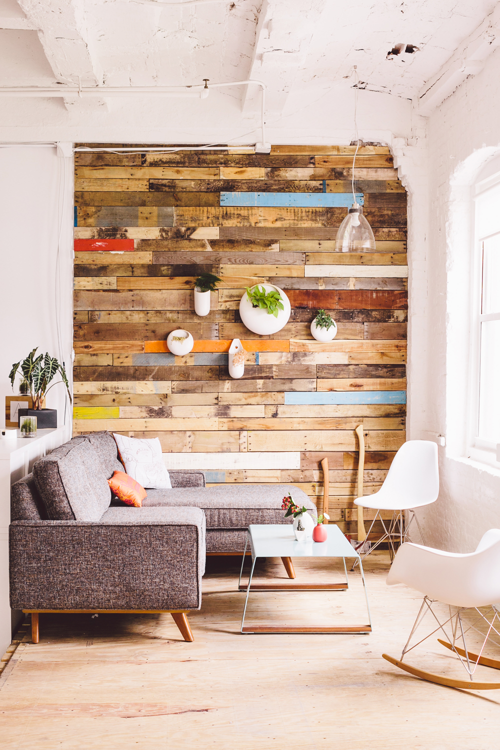
The easiest way to make an accent wall is to paint it in a different color. But there are other ways. You can use wallpaper, stencil it, write a poem, cover it with a different material, use washi tape, stamp it, paint geometrical figures, and so on.
In the end you’ll see the difference an accent wall can bring to a room.

Marta.

via cuckoo 4 design
via south by north
via a beautiful mess
via hgtv
via fellow fellow
via vintage revivals
via ann kelle
via julia robbs

Friday, November 28, 2014

Vélocité Café

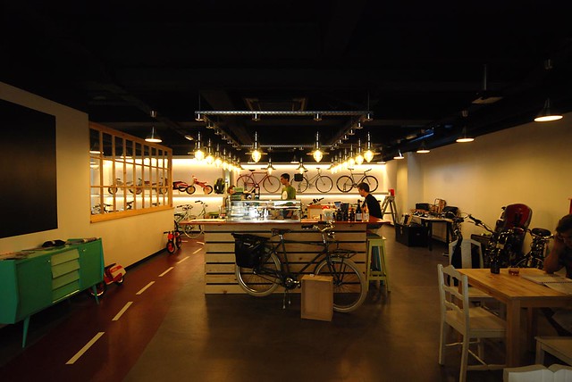
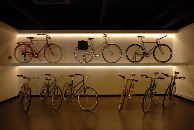
Vélocité Café is more than just a coffee shop. It’s also home to a bike workshop and a bike and accessories shop. In here everything is about bikes!
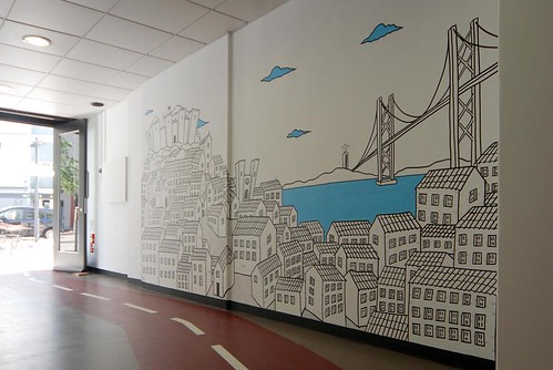
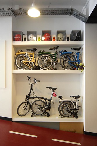
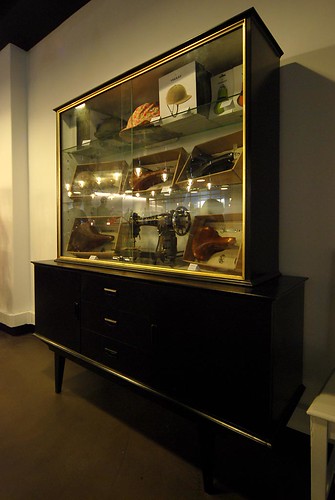
A retro decor with Nordic touches uses several of the bikes and vintage inspired accessories for sale as decor elements: racks, bags, handlebars, handgrips and wheels fill the walls and shelves here.
Although it looks small from the outside, the truth is that inside it has a few small tables with mismatched chairs, a bar in the center and the bike workshop with a huge glass window at the end on the left, where you can see all the work and/or restoration taking place. Outside there are a few tables overlooking a bike lane, which can be very pleasant on a sunny day, and a front bike set and wheel hang from the ceiling just above the front door.
The service and menu are very simple but efficient. Here everything is fresh and we can enjoy salads, vegetarian dishes and fresh pressed fruit juices. Oh! And if you arrive by bike you get 10% off!

Marta. 

vélocité café
via vélocité café
via miguel barroso
miguel barroso
miguel barroso
miguel barroso
miguel barroso